
Social Media Images: Sizes & Practices
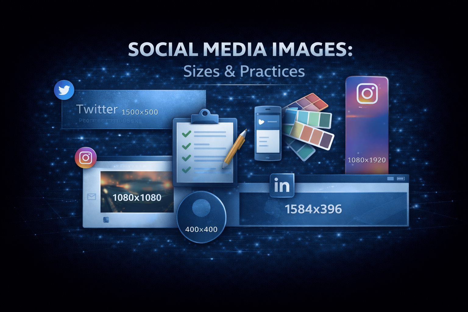
Every social platform has different image requirements. What looks perfect on Twitter might get cropped awkwardly on LinkedIn. A Facebook cover photo won’t work as an Instagram post.
Understanding these dimensions and designing within their constraints makes your content look professional across every platform.
Image size quick reference
Open Graph / link previews
| Platform | Size | Aspect Ratio |
|---|---|---|
| 1200×630 | 1.91:1 | |
| 1200×628 | ~1.91:1 | |
| 1200×627 | 1.91:1 | |
| 1200×630 | 1.91:1 | |
| Discord | 1200×630 | 1.91:1 |
Safe zone: Keep important content in the center 1080×560 area (some cropping varies)
Profile pictures
| Platform | Size | Shape |
|---|---|---|
| 400×400 | Circle | |
| 400×400 | Circle | |
| 170×170 | Circle (displays smaller) | |
| 320×320 | Circle | |
| TikTok | 200×200 | Circle |
Design tip: account for circular cropping, keep faces/logos centered
Cover photos / banners
| Platform | Size | Notes |
|---|---|---|
| Twitter Header | 1500×500 | 3:1 aspect ratio |
| LinkedIn Banner | 1584×396 | Personal profile |
| LinkedIn Company | 1128×191 | Company page |
| Facebook Cover | 820×312 | Desktop display |
| YouTube Banner | 2560×1440 | Safe area: 1546×423 |
Feed posts
| Platform | Sizes |
|---|---|
| Instagram Square | 1080×1080 |
| Instagram Portrait | 1080×1350 |
| Instagram Landscape | 1080×566 |
| Facebook Post | 1200×630 |
| LinkedIn Post | 1200×1200 or 1200×627 |
| Twitter Post | 1200×675 or 1200×1200 |
Stories
| Platform | Size |
|---|---|
| Instagram Stories | 1080×1920 |
| Facebook Stories | 1080×1920 |
| TikTok | 1080×1920 |
All use 9:16 aspect ratio for full-screen vertical content.
Design best practices
Keep text minimal
Social images are viewed quickly. If you include text:
- Use large, bold fonts
- Limit to a few words
- Ensure contrast with background
- Test at small sizes
Account for cropping
Different platforms crop differently. Design with a “safe zone”:
- Keep essential content in the center
- Avoid putting text near edges
- Test on multiple platforms
Maintain brand consistency
Use consistent:
- Colors (your brand palette)
- Fonts (your brand typography)
- Logo placement
- Visual style
Consider mobile first
Most social media is consumed on mobile:
- Text must be readable on small screens
- Simple compositions work better
- Avoid fine details that get lost
Use high contrast
Images compete in busy feeds:
- Bold colors stand out
- High contrast is more visible
- Avoid muddy or muted palettes
Creating images without design skills
Templates
Platforms like Canva offer templates sized correctly for each platform. Start with a template and customize.
Our social media image generator
The Social Media Image Generator lets you create images for:
- OG images (1200×630)
- Twitter headers (1500×500)
- LinkedIn banners
- Facebook covers
- Instagram posts
- And more
Features:
- Custom backgrounds (colors, gradients, images)
- Text with multiple fonts
- Logo upload
- Preset sizes for each platform
- Download in PNG format
It’s free and requires no design software.
AI image tools
For unique imagery:
- DALL-E, Midjourney for generated images
- Remove.bg for background removal
- Canva’s AI features
Platform-specific tips
Twitter/X
- Use
summary_large_imagecard for link previews - Headers get cropped on mobile (keep text centered)
- Animated GIFs work in tweets
- Max 4 images per tweet (displayed in grid)
- Professional aesthetic performs better
- Infographics and data visualizations work well
- Blue tones tend to perform (platform color psychology)
- Square images take up more feed space
- Cover photos crop differently on mobile vs desktop
- Link previews can be text-only or with image (algorithm decides)
- Video thumbnails matter for engagement
- Carousel posts show up to 10 images
- Consistent visual style builds following
- Portrait (4:5) takes up more feed space than square
- Carousel posts get more engagement
- Stories should feel less polished than feed
OG images specifically
For link previews (OG images), there are a few extra considerations:
Include branding
When links are shared, your OG image represents your site:
- Include your logo
- Use brand colors
- Consistent style across all pages
Include the title
For blog posts and articles:
- Render the article title in the image
- Use readable fonts
- Maintain hierarchy with author/site info smaller
Dynamic generation
For sites with many pages, generate images programmatically:
// Example: Using @vercel/og
import { ImageResponse } from '@vercel/og';

export async function GET(request) {
  const { searchParams } = new URL(request.url);
  const title = searchParams.get('title');

  return new ImageResponse(
    (
      <div
        style={{
          display: 'flex',
          fontSize: 60,
          background: 'linear-gradient(to right, #0ea5e9, #8b5cf6)',
          width: '100%',
          height: '100%',
          padding: '50px',
          alignItems: 'center',
          justifyContent: 'center',
          color: 'white',
        }}
      >
        {title}
      </div>
    ),
    { width: 1200, height: 630 }
  );
}
Testing your images
Before publishing:
- Check dimensions: verify correct pixel sizes
- Preview on platforms: use debuggers or our Social Media Preview
- Test on mobile: view on actual devices
- Check file size: keep under 5MB (ideally under 1MB)
Image optimization
File size
Large images slow down previews:
- Compress JPGs to 80% quality
- Use PNG only when transparency needed
- Consider WebP where supported
- Use tools like TinyPNG, Squoosh
Loading speed
OG images are fetched by platform crawlers:
- Host on fast servers or CDNs
- Use proper caching headers
- Avoid redirects
Accessibility
Even for social images:
- Don’t rely solely on images for information
- Provide alt text where supported
- Ensure sufficient color contrast
Take action
- Audit your current social images
- Create properly sized images using Social Media Image Generator
- Test previews with Social Media Preview
- Update OG images for key pages
- Establish consistent templates for future content
For help with social media design or brand strategy, reach out.
Need help shipping?
We help teams build and ship software that works. Performance, SEO, features, weekly demos, full ownership.
Get a Free Audit